 admin
October 15, 2018
admin
October 15, 2018
Big typography, more cards, and less animation.
With the introduction of iOS 10, Apple has begun a significant shift away from its previous design language. Where before we were seeing thin, light typography, we’re now seeing heavy, large, emphatic titles. We’re seeing a shift from edge-to-edge elements towards a more card-based, spacious user interface.
Gentler visual effects have also made their way onto iOS — the first use of depth on the platform since iOS 6. In addition, animation and interaction have become more refined, considered, and subtle.
Apple has determined a significant part of the design trends over the past decade, not just on mobile, but on the web too. Their influence is undeniable. Back when iOS 7 was introduced, it took the design industry by storm and confirmed a new standard and style for user interface design. Android is having a similar effect having introduced their Material Design guidelines a couple of years ago.
In the most refined update in years, we’re going to look into the design changes introduced in iOS 10 and consider how they will have an impact on the current web design trends. Some websites are already beginning to implement these new styles and directions.
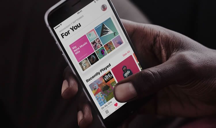
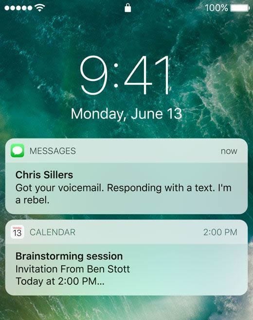
Large, Emphatic Typography
Apple has begun a shift away from its previous use of small and lightweight font styles. In an attempt to make apps such as Apple Music more user-friendly and decluttered, they have introduced a more visual style with less focus on maximizing the volume of content shown.
This is likely to trigger a move away from thinner font-weights on the web, and towards a bold, visual style regarding titles, headlines, introductions, and other prominent typographic elements. In doing so, websites will look more impactful and improve user experience with more legible typography.

Left-aligned titles are another intriguing recurrence in iOS 10 and signal a minor step towards an Android-like header, with a more asymmetrical approach — something we may see more of on the web in the near future.
We’re already beginning to see this trend come to fruition as Apple’s influence and design language is conveyed to designers. The use of this in the above example is a refreshing change to the smaller and lighter typographic experience we have been used to over the last few years.
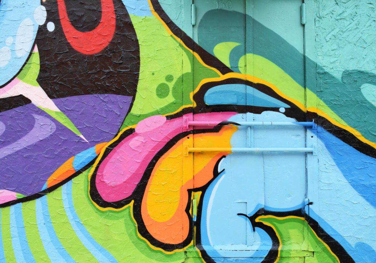
Subtle Visual Effects
Apple has made its first move away from the truly flat interface that has been in use since iOS 7. In doing so, it is beginning a new phase whereby depth and element contrast is now an essential part of the visual experience.
It’s a more subtle and refined attempt at the depth we had become so accustomed to pre-iOS 7. It should help in providing a better separation between elements, and a richer visual experience, without going overboard.
The introduction of Google’s Material guidelines begun a shift towards this style, and Apple now looks to refine it with a more appealing approach.
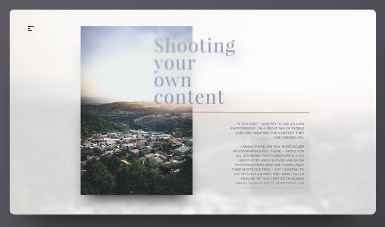
Both of the above examples provide an excellent implementation of the style on web, and other websites look set to follow as the minimalism and brutalist minimalism trends begin to fade out.
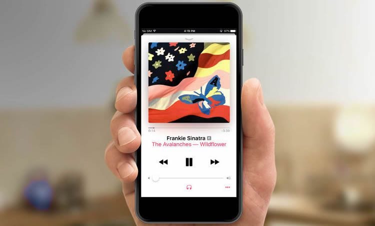
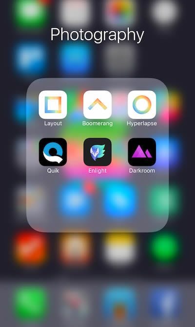
Card-Based User Interface
Where previously Apple used edge-to-edge elements throughout the iOS interface, a shift has now been made to a card-based interface that can be seen throughout notifications, menus, and information widgets.
This seeks to provide an enhanced visual experience and one with more depth and separation. Throughout iOS 10, Apple has centered the bulk of the changes around introducing more space into the interface, moving away from the previous versions where space was densely populated with elements and content.
This has begun a change in how websites are displaying content, banners, and notification content.
More sites look set to move from edge-to-edge elements to more modular, spacious interfaces with greater visual separation. This should aid users by making content more manageable and easier to locate and differentiate.
Reduction in Animation
With iOS 10 there’s a greater reduction in overzealous animation. The shift has seen the introduction of interaction and animations that contain far less movement and intense zooming in and out. The changes make the experience quicker, more pleasurable to use, and a lot more easy on the eye.
The hope is that this brings about a change on the web where we see less fancy, more refined animations. This will allow for greater usability and quicker interaction.
This may even signal the beginning of the end for scroll-jacking and unnecessary loading animations, as Apple makes it clear with iOS 10 that performance refinements are as much a priority as visual.
Naturally, users of the most popular phone and tablet in the world want to see the styles, methods, and directions that they experience all day every day, translated to web.
This is particularly relevant now more than ever as mobile web users are increasing all the time. We never quite know where web styles are headed next, but Apple has given web designers a lot of new ideas and inspiration since the introduction of the first iPhone.
Over the years we have seen a wide variety of styles transition from iOS to the web, and this looks as likely as ever to continue into the future.


So clearly and compellingly written — thank you for sharing your story. I think a lot of professional women (myself) included can really relate.